ZGen Tech
August 2020 - December 2022
Software Engineer
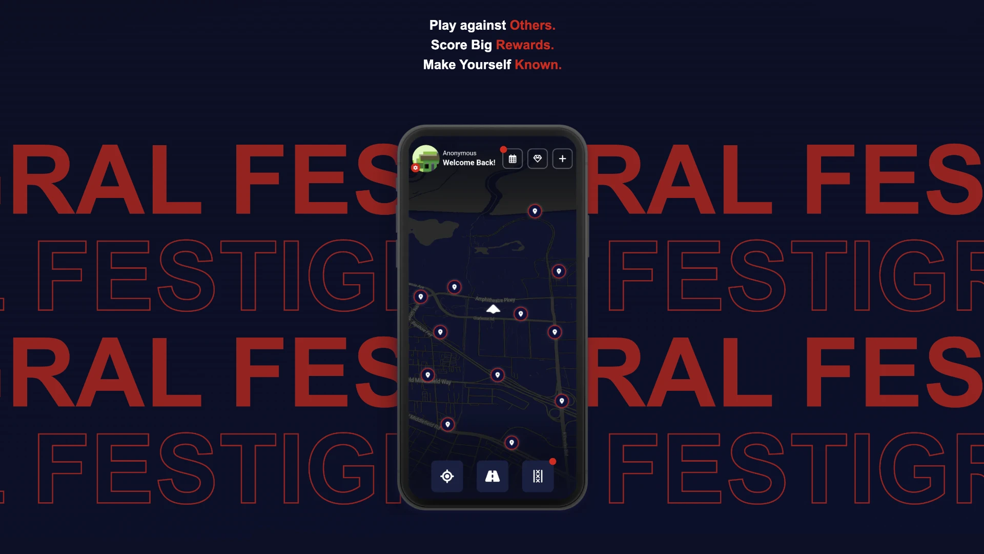
The digital facade of Festigral, an exclusive community platform dedicated to the underground scene, specializing in high-stakes events.
An Introduction
The Festigral web portal marked the inaugural foray into the app's ecosystem, serving as a central hub for newcomers to discover the latest updates and understand the essence of Festigral. The website was meticulously crafted to serve as a compelling sales pitch, showcasing the distinctive features that set Festigral apart, all the while offering a rich learning experience in utilizing React for crafting innovative web solutions.
Skill Breakdown
[ Frontend ]
90%
[ Backend ]
36%
[ Database ]
43%
[ Other ]
78%
Major Technologies and Concepts Used
[ Frontend ]
React
Next.JS
HTML
CSS
Javascript
[ Backend ]
Node.JS
SSR
[ Database ]
[ Other ]
SMTP
API Layer
Vercel
Affinity Photo
The website that laid the groundwork for everything
The journey of Festigral began with the creation of its website, envisioned as a digital gateway where curious minds could delve into the essence of the product. This platform was not just about providing basic information; it was meticulously designed to engage visitors through carefully curated blog posts, offering deep dives into the features, philosophy, and community that define Festigral.
It served as the foundational stone, setting the stage for what Festigral would become, and acted as a beacon for those seeking to explore and connect with the unique experiences it promised. Through this website, Festigral started to weave its narrative, inviting users to become part of a journey that was just beginning to unfold.
What began as a straightforward task for a client swiftly evolved into something far more significant.
- Yahffa Jagrup
The website's feature set was intentionally designed to be simple yet effective, focusing on delivering a user-friendly experience right from the start. At its core, an inviting and engaging landing page welcomed visitors, seamlessly guiding them to a blog section rich with detailed information and insights about the platform.
Beyond these elements, essential components such as a contact page, a 'request to delete your account' option, and an informative 'about us' section were seamlessly integrated. These features were not just added as afterthoughts but were carefully considered to ensure users had all the necessary tools for a comprehensive understanding and interaction with the site, reflecting the thoughtful approach behind the website's development.
Enhancing the platform with essential additions: a comprehensive blog, a robust 'Contact Us' section, and a secure 'Delete Your Account' feature.
- Yahffa Jagrup
Developing the blog section proved to be an intriguing endeavor. The client's request was for a user-friendly solution that eliminated the need for coding expertise to manage site updates. This requirement inspired the development of an intuitive admin tool, enabling the owner to effortlessly generate Markdown files for the blog with the content they supplied.
The ability to effortlessly update the blog emerged as a highlight feature.
- Yahffa Jagrup
Topics That Captured My Interest
Explore the diverse topics and insights that have captured my curiosity.
This project was a treasure trove of invaluable insights offering a deep dive into contracting intricacies and startup culture dynamics.
React served as the cornerstone framework. It laid a robust groundwork for web development while also granting insights into one of the globally acclaimed web frameworks.
Developing a robust method for blog updates emerged as an enjoyable challenge ultimately leading to a solution that greatly pleased the client.
The implementation of the 'Delete your account' feature was an intriguing challenge. By carefully balancing security and scalability we ensured the website's stability even during periods of high traffic.
Designing an extensive 'Contact Us' section that adeptly conveyed user concerns while guaranteeing message delivery to the client offered an enlightening exploration into the intricacies of SMTP servers.
Supporting the client with content creation was a delightful experience. It offered a chance to enrich my creative outlook while further honing my development expertise.
Final Thoughts
As Festigral's digital presence continues to grow, the website remains at the heart of our journey—a testament to the power of collaboration, innovation, and the relentless pursuit of excellence. Each feature, from the dynamic 'Contact Us' section to the insightful blog updates, has been crafted with the user in mind, ensuring a seamless and enriching experience for all who visit.
Similar Showcases

1 / 3
Software Engineer
January 2022 - September 2023 | ZGen Tech
As the lead designer and developer of Festigral, I orchestrated and collaborated with several key individuals and designers to streamline the construction and distribution of the Festigral app using Flutter / Dart.
Key Skills:
Flutter
Dart
Full Stack Development
Firebase
Node.JS
Swift
iOS
API Development
Android
GCP
2 / 3
Junior Software Engineer
November 2017 - June 2018 | ZGen Tech
Designed and built a computer vision assistant in Python. This incorporated several technologies that allowed for object detection, speech recognition, web scraping and advanced mathematics problem solving.
Key Skills:
Python
Open CV
Wolfram Alpha
TensorFlow
JSON
Flask
Image Recognition
Speech Recognition
3 / 3
Software Engineer
September 2019 - July 2020 | ZGen Tech
Aided in the process of creating a fully decentralized blockchain based e-commerce marketplace. This ‘Backend-As-A-Service’ was created to explore the viability of a blockchain based e-commerce platform.